


CSSでハニカム構造-六角形をつくって並べる方法
ハニカム構造とはハチの巣のごとく六角形が並んだ構造をいいますが、これをCSSで作成してみます。
例えばこんな風にテキストを並べることができます。

六角形の基本形をつくる
clip-path makerでCSSを取得する
六角形をCSSで作成するには、clip-pathを使うのが簡単です。
clip-path makerを使えば、六角形を生成するclip-pathを得ることができます。
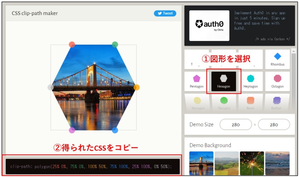
得られたCSSは以下の通りです。
clip-path: polygon(25% 0%, 75% 0%, 100% 50%, 75% 100%, 25% 100%, 0% 50%);
正六角形の基本形を作成
得られたCSSを使ってまずは正六角形を作成します。以下のHTMLとCSSとなります。
HTML
<div class="hexagon-0__wrapper">
	<div class="hexagon-0_hexagon">
		<span>text</span>
	</div>
</div>
CSS
.hexagon-0__wrapper {
	display: flex;
	justify-content: center;
}
.hexagon-0_hexagon {
	display: flex;
	justify-content: center;
	align-items: center;
	width: 50%;
	aspect-ratio: 200 / 173;
	background-color: #333;
	clip-path: polygon(25% 0%, 75% 0%, 100% 50%, 75% 100%, 25% 100%, 0% 50%);
	color: white;
}
これにより次の六角形を描くことができます(カスタムHTMLブロックで上記コードを入力して表示しています)。
cssの12行目に先ほどclip-path makerで得たコードを使っています。
このとき10行目でaspect-ratioを200:173にしていることに注意してください。縦横比1:1の四角形をベースにclip-pathを適用しても正六角形にならずに縦長の六角形になってしまうので、200:173として正六角形を得ています。(ちなみに173という数字は、√3から算出したものです。なのでケタを増やして精度を上げたければ、173.20508・・・と増やせばOKです。)
縁付きの正六角形とする
HTMLはクラス名のみの変更、およびCSSの修正により縁付きとします。
HTML
<div class="hexagon-1__wrapper">
	<div class="hexagon-1_hexagon">
		<span>text</span>
	</div>
</div>
CSS
.hexagon-1__wrapper {
	display: flex;
	justify-content: center;
}
.hexagon-1_hexagon {
	display: flex;
	justify-content: center;
	align-items: center;
	width: 50%;
	aspect-ratio: 200 / 173;
	background-color: #333;
	clip-path: polygon(25% 0%, 75% 0%, 100% 50%, 75% 100%, 25% 100%, 0% 50%);
}
.hexagon-1_hexagon>span {
	display: flex;
	justify-content: center;
	align-items: center;
	width: 90%;
	aspect-ratio: 200 / 173;
	background-color: #fff;
	clip-path: polygon(25% 0%, 75% 0%, 100% 50%, 75% 100%, 25% 100%, 0% 50%);
}
このように縁付きとなります。
六角形を並べる
それでは六角形を増やして並べてみます。
HTML
<div class="honeycomb-area">
	<div class="hexagon2__wrapper">
		<div class="hexagons">
			<div class="hexagon-2_hexagon">
				<span>Left-up</span>
			</div>
			<div class="hexagon-2_hexagon">
				<span>Left-middle</span>
			</div>
			<div class="hexagon-2_hexagon">
				<span>Left-down</span>
			</div>
		</div>
		<div class="hexagons">
			<div class="hexagon-2_hexagon">
				<span>Center-up</span>
			</div>
			<div class="hexagon-2_hexagon">
				<span>Center-middle</span>
			</div>
			<div class="hexagon-2_hexagon">
				<span>Center-down</span>
			</div>
		</div>
		<div class="hexagons">
			<div class="hexagon-2_hexagon">
				<span>Right-up</span>
			</div>
			<div class="hexagon-2_hexagon">
				<span>Right-middle</span>
			</div>
			<div class="hexagon-2_hexagon">
				<span>Right-down</span>
			</div>
		</div>
	</div>
</div>
CSS
.hexagon2__wrapper {
	display: flex;
	flex-wrap: wrap;
	--wrapper-width: 70%;
	width: var(--wrapper-width);/* 全体の大きさを変更できる */
}
@media(max-width: 768px) {
	.hexagon2__wrapper {
		--wrapper-width: 100%;
		font-size: 3vw;
	}
}
.hexagons {
	width: calc(100% /3);
}
.honeycomb-area {
	display: flex;
	justify-content: center;
}
.hexagon-2_hexagon {
	display: flex;
	justify-content: center;
	align-items: center;
	width: 100%;
	aspect-ratio: 200 / 173;/* 正六角形になる比率 */
	background-color: #333;
	clip-path: polygon(25% 0%, 75% 0%, 100% 50%, 75% 100%, 25% 100%, 0% 50%);
}
.hexagon-2_hexagon>span {
	display: flex;
	justify-content: center;
	align-items: center;
	width: 90%;
	height: 90%;
	background-color: #fff;
	clip-path: polygon(25% 0%, 75% 0%, 100% 50%, 75% 100%, 25% 100%, 0% 50%);
}
以下の通りです。
六角形をフレックスボックスで並べただけです。
レイアウトを整える
あとはレイアウトを整えていきます。transformプロパティとマイナスmarginを使ってレイアウトしています。
HTML
クラス名以外に変更点はありません。
<div class="honeycomb-area">
	<div class="hexagon3__wrapper">
		<div class="hexagons hexagons-left">
			<div class="hexagon-3_hexagon">
				<span>Left-up</span>
			</div>
			<div class="hexagon-3_hexagon">
				<span>Left-middle</span>
			</div>
			<div class="hexagon-3_hexagon">
				<span>Left-down</span>
			</div>
		</div>
		<div class="hexagons hexagons-center">
			<div class="hexagon-3_hexagon">
				<span>Center-up</span>
			</div>
			<div class="hexagon-3_hexagon">
				<span>Center-middle</span>
			</div>
			<div class="hexagon-3_hexagon">
				<span>Center-down</span>
			</div>
		</div>
		<div class="hexagons hexagons-right">
			<div class="hexagon-3_hexagon">
				<span>Right-up</span>
			</div>
			<div class="hexagon-3_hexagon">
				<span>Right-middle</span>
			</div>
			<div class="hexagon-3_hexagon">
				<span>Right-down</span>
			</div>
		</div>
	</div>
</div>
CSS
.hexagon3__wrapper {
	display: flex;
	flex-wrap: wrap;
	--wrapper-width: 70%;
	width: var(--wrapper-width);/* 全体の大きさを変更できる */
	margin-right: calc(-1 * var(--wrapper-width) / 3 * 0.25 * 2 - var(--wrapper-width) / 3 * 0.05 * 2);
	margin-bottom: 20%;
}
@media(max-width: 768px) {
	.hexagon3__wrapper {
		--wrapper-width: 100%;
		font-size: 3vw;
	}
}
.hexagons {
	width: calc(100% /3);
}
.honeycomb-area {
	display: flex;
	justify-content: center;
}
.hexagon-3_hexagon {
	display: flex;
	justify-content: center;
	align-items: center;
	width: 100%;
	aspect-ratio: 200 / 173;/* 正六角形になる比率 */
	background-color: #333;
	clip-path: polygon(25% 0%, 75% 0%, 100% 50%, 75% 100%, 25% 100%, 0% 50%);
}
.hexagon-3_hexagon>span {
	display: flex;
	justify-content: center;
	align-items: center;
	width: 90%;
	height: 90%;
	background-color: #fff;
	clip-path: polygon(25% 0%, 75% 0%, 100% 50%, 75% 100%, 25% 100%, 0% 50%);
}
/* 2行目と3行目の六角形を上にずらして縁を重ねる */
.hexagon-3_hexagon:nth-of-type(2),
.hexagon-3_hexagon:nth-of-type(3) {
	margin-top: -5%;
}
/* 中央の列を下にずらす */
.honeycomb-area .hexagons-center {
	transform: translateY(calc(100% / 6));
}
/* 2列目と3列目の六角形を左にずらして縁を重ねる */
.honeycomb-area .hexagons-center,
.honeycomb-area .hexagons-right {
	margin-left: calc(-100% / 3 * 0.25 - 100% / 3 * 0.05);
}
完成形です。
CSSでの横幅などは、すべて%指定しているので、レシポンシブ対応になっています。
もし全体の大きさを変更したければ、4行目(PC向け)および11行目(スマホ向け)で指定している–wrapper-widthの値を変更してみてください。デフォルトではPC70%、スマホ100%としています。ここはpx指定も可能です。
CSSの40行目以降がレイアウト調整のCSSですが、マイナスマージンで2列目と3列目を左に寄せているため左に寄ったレイアウトとなってしまいます。そこで6行目でマイナスマージンを全体のラッパーにかけて、左に寄っているのを打ち消しています。
応用例ー背景画像を設定ー
ハニカム構造を使って画像を並べてみました。
画像を各六角形ごとに変更することも可能です。またリンクをつければ、各種アピールにも使えますね。
一応HTMLとCSSも貼っておきます。
HTML
<div class="honeycomb-image-area">
	<div class="hexagon5__wrapper">
		<div class="hexagons hexagons-left">
			<div class="hexagon-5_hexagon">
				<span></span>
			</div>
			<div class="hexagon-5_hexagon">
				<span></span>
			</div>
		</div>
		<div class="hexagons hexagons-center">
			<div class="hexagon-5_hexagon">
				<span></span>
			</div>
			<div class="hexagon-5_hexagon">
				<span></span>
			</div>
			<div class="hexagon-5_hexagon">
				<span></span>
			</div>
		</div>
		<div class="hexagons hexagons-right">
			<div class="hexagon-5_hexagon">
				<span></span>
			</div>
			<div class="hexagon-5_hexagon">
				<span></span>
			</div>
		</div>
	</div>
</div>
CSS
.honeycomb-image-area {
	display: flex;
	justify-content: center;
}
.hexagon5__wrapper {
	display: flex;
	flex-wrap: wrap;
	--wrapper-width: 100%;
	width: var(--wrapper-width);/* 全体の大きさを変更できる */
	margin-right: calc(-1 * var(--wrapper-width) / 3 * 0.25 * 2 - var(--wrapper-width) / 3 * 0.05 * 2);
	margin-top: 20%;
}
.hexagons {
	width: calc(100% /3);
}
.hexagon-5_hexagon {
	display: flex;
	justify-content: center;
	align-items: center;
	width: 100%;
	aspect-ratio: 200 / 173;/* 正六角形になる比率 */
	background-color: #ff0;
	clip-path: polygon(25% 0%, 75% 0%, 100% 50%, 75% 100%, 25% 100%, 0% 50%);
}
@media(max-width: 768px) {
	.hexagon5__wrapper {
		--wrapper-width: 100%;
		font-size: 3vw;
	}
}
.hexagon-5_hexagon>span {
	display: flex;
	justify-content: center;
	align-items: center;
	width: 90%;
	height: 90%;
	background-image: url(https://web-children.com/wp-content/uploads/2023/04/female-cameraman.jpg);/* 背景画像を指定 */
	background-size: cover;
	clip-path: polygon(25% 0%, 75% 0%, 100% 50%, 75% 100%, 25% 100%, 0% 50%);
}
/* 2行目と3行目の六角形を上にずらして縁を重ねる */
.hexagon-5_hexagon:nth-of-type(2),
.hexagon-5_hexagon:nth-of-type(3) {
	margin-top: -5%;
}
/* 中央の列を上にずらす */
.honeycomb-image-area .hexagons-center {
	transform: translateY(calc(-100% / 6));
}
/* 2列目と3列目の六角形を左にずらして縁を重ねる */
.honeycomb-image-area .hexagons-center,
.honeycomb-image-area .hexagons-right {
	margin-left: calc(-100% / 3 * 0.25 - 100% / 3 * 0.05);
}
まとめ
本記事では六角形を使ったコンテンツを紹介しましたが、clip-pathを使えば、さまざまな形のコンテンツを作成することが可能です。
例えば三角形の矢印や、これを使った吹き出しなど・・・これらは通常borderプロパティを使って三角形を作成する、という手法が一般的ですが、私はclip-pathを使っています。その方が慣れると直感的に作成することができるからです。どうもborderを使って三角形を創り出すという手法は私は苦手で、例えば少し形を変えたいと思ったときに手こずるんですよね。
ご参考になれば幸いです。
